
The most expensive sentence in software
A CEO said this to us recently, after we walked him through a product concept his team had been developing: "Doesn't seem like such a big lift. I bet we could build version 1.0 in Claude tonight."
He's right. They probably could.
Taken at face value, that sentence might be the most expensive one he's ever said — and he genuinely believes it to be the least. Because version 1.0 built in Claude tonight isn't the hard part. It never was. The hard part is the version that exists six months later, after real users have found the edges, after the seams have shown, after the thing that looked like software turns out to be a scaffold with a confident coat of paint. The hard part is building software that people don't just tolerate — software they trust, return to, and eventually can't imagine working without.
That gap — between "it works" and "it's worth something" — is where most software goes to die. And increasingly, it's the only gap that matters.
Two frameworks and a problem
Tim Doll, CEO and President of Precocity, has spent years thinking about what separates software that survives from software that doesn't. His answer is four dimensions — four load-bearing pillars that any piece of software must stand on to have a genuine shot at success.
Software needs to be Valuable: it addresses a problem that actually costs someone something. Useful: people can accomplish something meaningful with it they couldn't before. Trustworthy: it behaves consistently, honestly, and without unpleasant surprises. And Enjoyable: the experience of using it is, at some level, worth having.
Pull any one of these out, and the structure becomes unstable. Useful but not trustworthy is a liability. Enjoyable but not valuable is a toy. Valuable and trustworthy but miserable to use is most enterprise software, which is, as anyone who has filed an expense report in 2025 can confirm, its own special circle of hell.
Now layer in a second framework. Stephen Anderson's UX Hierarchy of Needs maps Maslow's famous pyramid onto human experience with technology. Starting from the bottom: software must first be Functional (does it work at all?), then Reliable (does it keep working?), then Usable (can I figure it out?), then Convenient (does it fit into my actual life?), then Pleasurable (does it delight me?), and finally — rarely, gloriously — Meaningful (does it matter to me?).
Most software never makes it past Reliable. A shocking amount doesn't clear Functional.
Here's the insight we've built our practice around: these two frameworks aren't competing with each other. They aren't even parallel. One describes what your software needs to be. The other describes how deeply it can go. The four pillars support the entire hierarchy. And the goal — for any feature, any interaction, any decision — is to move up and to the right.
The Craft Matrix
We call the synthesis of these two frameworks the Craft Matrix.
Map the four pillars across the horizontal axis. Stack Anderson's six hierarchy levels vertically. What you get is a 4×6 matrix where every cell represents a question: how deeply does this pillar express itself at this level of human need?
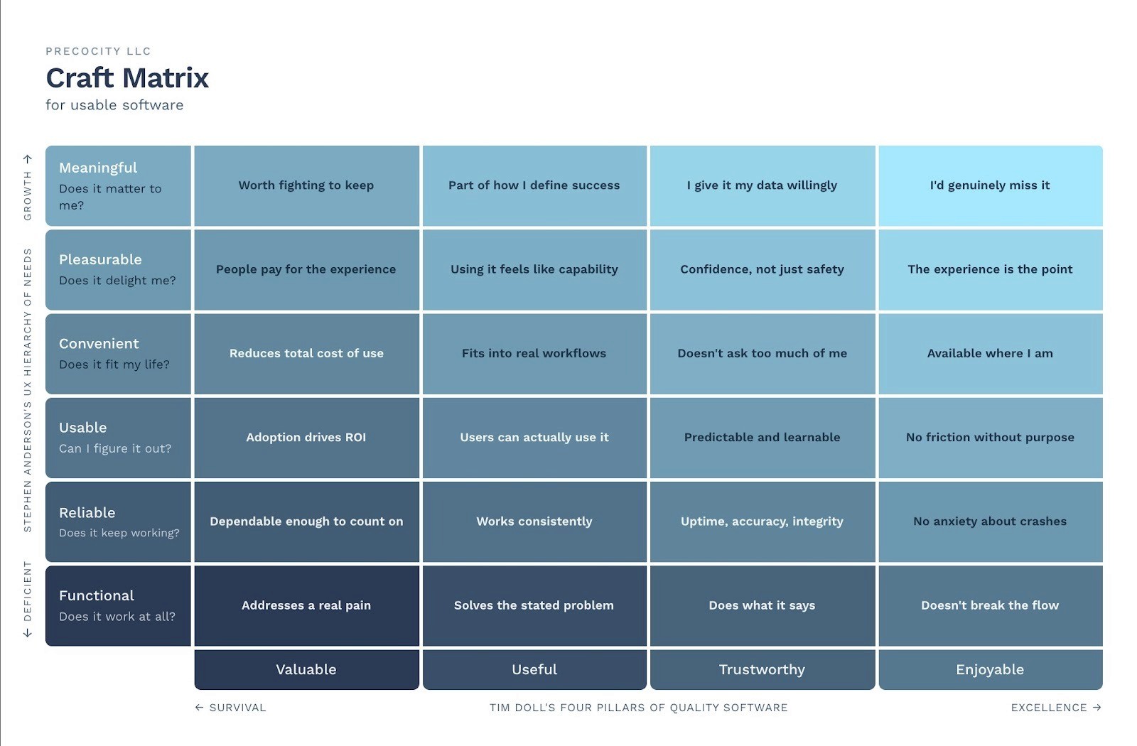
The bottom-left of the matrix — Functional × Valuable — is where most product decisions get made. Does it address a real problem? That's the question in discovery sessions, sprint planning, and pitch decks. It's a necessary question. It's just nowhere near sufficient.
The top-right — Meaningful × Enjoyable — is where almost no product decisions get made. But it's where the best software lives. And it's where the products that generate real loyalty, real word-of-mouth, and real defensibility tend to cluster.
The color tells the story before you read a word. Dark and heavy at the bottom-left — where software merely survives. Light and open at the top-right — where software earns something rarer than adoption. It earns affection.
The journey from one to the other is not a feature roadmap. It's a philosophy.
Not “more” features. Better.
There's a belief embedded in most software development cultures that I'd like to politely dismantle: that comprehensiveness is the path to excellence. That more features, more coverage, more functionality is what moves a product up the matrix.
It isn't. A product with two features, each expressed at the Meaningful level across all four pillars, is categorically better than a product with fifty features that never climb past Usable. The goal isn't to have every feature under the sun. The goal is to ensure that every feature you do have is reaching as high as it possibly can — standing on all four pillars, not just one.
This is also true at the atomic level. Every feature is itself made of smaller decisions: the copy, the transition, the error state, the confirmation, the empty state, the loading behavior, the way the interface responds when something goes wrong. Each of those is a cell of its own. Each one is a vote for where your software lives on the matrix.
The sum of all those small votes is not small. McKinsey tracked the design practices of 300 publicly listed companies over five years and found that those in the top quartile of design performance saw 32% higher revenue growth and 56% higher total returns to shareholders. That's not a design agency making the case for design. That's McKinsey, with five years of financial data, saying that craft compounds.
The AI moment, honestly assessed
Let's talk about what's actually changed — and what hasn't.
The commoditization of development and large swaths of visual design means that the Functional and Reliable layers of the hierarchy are now genuinely accessible to almost anyone. An AI-assisted developer can ship working, reasonably stable software in a fraction of the time it would have taken five years ago. That CEO isn't wrong about that.
What that means, though, is that those bottom two rows of the matrix are no longer sources of competitive advantage. They're table stakes. They're the floor, not the ceiling. If your value proposition as a software team is "we ship working software that doesn't crash," you're describing the minimum viable bar for entry, not a reason for anyone to choose you.
But here's what doesn't get said enough: AI hasn't eliminated the craft requirement. It eliminates the cost excuse. Before, you could argue that microinteraction polish, thoughtful error states, and well-crafted empty state copy were expensive — they required time that lean teams didn't have. That argument is gone. AI can write your error messages. It can generate your hover states, your onboarding copy, and your confirmation dialogs.
What it produces, reliably, is the average of everything it's seen. The average error message. The average onboarding flow. The average empty state. And the average is, by definition, not the top-right of the matrix.
AI accelerates the race to the middle. Human craft is what breaks out of it. The teams that understand this are going to look very different from the teams that don't, very quickly.

The small things are the whole thing
If the competitive frontier has migrated upward in the hierarchy, the practical implication is uncomfortable for teams optimized for speed: you need to slow down precisely at the moments that feel most like overhead.
The hover state. The confirmation dialog. The way a form validates in real time. The empty state copy. The error message that tells you what went wrong and what to do next, rather than surfacing a technical apology and a code you'll never look up.
These are not decorative decisions. They are structural ones. Marshall McLuhan was talking about television when he said the medium is the message — but he might as well have been talking about interaction design. The way your software behaves is what your software is saying about how much it respects the person using it.
Consider Google's offline dinosaur game. You lose internet access — a moment of pure Functional failure — and a small pixelated T-Rex appears, waiting for you to press a key, inviting you to play. A team at Google decided that a moment of infrastructure breakdown was an opportunity for delight. That's a microinteraction converting a Functional problem into a Pleasurable experience. The matrix in action, in two kilobytes.
Or the Mailchimp high-five. Before you send an email campaign — a moment loaded with anxiety, the "did I miss something" dread that anyone who's ever accidentally emailed 40,000 people with a broken link knows intimately — an animated hand gives you a high five. Two seconds. No additional information. Just a moment of human warmth inside an otherwise transactional flow. Pleasurable × Trustworthy operating through a single animation.
Apple's password field shake is even smaller: when you type the wrong password, the field moves side to side — the universal human gesture for "no." No text needed. Immediate, embodied, and somehow kind rather than punishing. Usable climbing toward Pleasurable in 0.3 seconds and three lines of animation code.
None of these is expensive. All of them required someone to care.
What good looks like
A few products that have earned the right to live in the top-right, and what we can learn from each.
1Password shouldn't be delightful. It's a security product. It operates in the most anxiety-laden corner of software — passwords, credentials, the existential dread of being locked out of your own digital life. Most security software is designed as if users should feel the weight of their responsibility at all times. 1Password is designed as if users deserve to feel safe and at ease. The Travel Mode feature — where you can hide specific vaults when crossing borders — is a masterclass in Convenient × Trustworthy climbing toward Meaningful. It's proof that no category of software is exempt from the matrix. Utility software can live in the top-right. It just requires someone to decide that it should.
Rachio is a sprinkler controller. This should not matter. And yet Rachio somehow makes you care about your lawn's hydration schedule — weather intelligence that skips a cycle before rain, push notifications that feel more like good news than alerts, the quiet satisfaction of watching your watering adapt in real time to conditions you didn't have to monitor. It takes infrastructure — the most Functional, least Meaningful category of software imaginable — and finds the craft decisions that push it upward. If a sprinkler app can live in the top-right of the matrix, your product has no structural excuse for not trying.
Day One is the clearest Meaningful example I can think of. It's a journaling app, which means the content is inherently personal — but the software's job is to be worthy of that content. The end-of-year review feature, the on-this-day memories, the quiet restraint of the typography — these are decisions about how software should feel to someone at their most reflective. Day One earns the top row of the matrix because it knows what it's for at a depth most software never reaches. It's not trying to be more. It's trying to be more itself.
Running a Craft Matrix audit
The Craft Matrix isn't just a way to appreciate good software. It's a diagnostic tool — and you don't have to run it on your entire product at once. Start with one feature. The one your users touch most, the one that causes the most support tickets, the one you shipped fast and always meant to go back to.
Ask four questions:
Valuable: Does this solve a problem that actually costs someone something? Not a problem the team invented, not a problem that sounds good in a brief, but a real one with a real cost?
Useful: Can someone accomplish something meaningful with this that they couldn't accomplish before, or accomplish more easily than before?
Trustworthy: Does this behave consistently, honestly, and without surprising anyone in ways that cost them time or confidence?
Enjoyable: Is there anything about the experience of this feature that could be genuinely better than it needs to be, without adding time, without adding scope, just through the quality of the decision?
Then ask the hierarchy question. Given where this feature currently lives, what would it take to move it one level up? Not ten levels. One. What's the single decision — the copy, the animation, the error state, the confirmation — that would push this from Usable to Convenient? From Convenient to Pleasurable?
Make that decision. Ship it. Then do the next feature. Over time, you develop fluency — a habit of reading the matrix in everything you build, a reflex for finding the craft decision hiding inside the functional one. And eventually, when you zoom out and look at the whole product, you'll find that the sum of all those small intentional moves has taken you somewhere you couldn't have navigated to directly.
The CEO who told us he could build version 1.0 in Claude tonight will have version 1.0 by morning. What he won't have — what no prompt can generate — is the accumulated judgment about what that product should feel like to the person using it at 11 pm when something goes wrong, and they're alone with the interface. That judgment is craft. And craft, it turns out, is the only thing AI can't commoditize.
Build accordingly.
—
Brandon Ward is Chief Experience Officer at Precocity, a UX Design, UX Research, and Service Design practice working with enterprise organizations. The four pillars referenced in this article were developed by Tim Doll, CEO and President of Precocity. The Craft Matrix is a Precocity synthesis of Doll's pillar model and Stephen Anderson's UX Hierarchy of Needs.


