
The opposite of complexity is not simplicity, it’s clarity.
Designers love to worship at the altar of "simple". We chant the tired refrain: "Less is more. KISS: Keep it simple stupid. Cut the clutter." But simplicity is an illusion—a myth we've perpetuated to feel like we're making progress as we strip away features and functions, signifiers and affordances, shaving off the meat of our systems to gnaw at the bone for scraps of marrow and calling it "minimalism".

Simplicity is dead
As Jason Fried said in 2004, simplicity is dead. The truth is, simplicity doesn't exist in design. Not the way we tend to think about it anyway. Nothing we create is inherently simple or complex. What matters is how people experience it. And the only experience that matters is clarity. This sounds like a tomato/potato semantic argument, but the core of the difference between simplicity and clarity is critical: Context.
Simple can still be confusing
Clarity means creating flows, layouts, and micro-interactions that feel effortless, natural, and intuitive for the people who matter most: our users. Simplicity may emerge as a side effect, but it is not the goal. The goal is to craft experiences that “just work” in the moment of need, clearly, and effectively.
Context matters
As designers, we must stop fetishizing minimalism for its own sake and start prioritizing clarity and effectiveness. That means understanding the difference between simple and clear. Simplistic design reduces complexity through subtraction alone, with no guiding vision, often throwing the baby out with the bathwater. Designing for clarity achieves ease and intuition through deliberate, thoughtful choices informed by understanding user needs and behavior. This will sometimes involve reduction but also may involve addition.
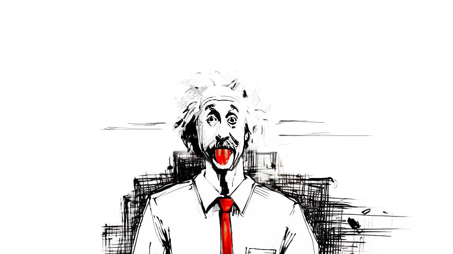
“Everything should be as simple as it can be, but not simpler.” — Albert Einstein
Mac & cheese
Macaroni, cheese powder, butter, water, and milk. Now make it simpler by reducing the ingredient list. You can't. Make it simpler by just dumping everything into the pot at once. You can't. Clear design considers the ingredients, the process, the end product, and the cook as well as the consumer, then proposes a flow to get from box to delicious cheesy comestible as efficiently as possible. Reduction fails. Clarity beats simplicity every time. Trying to measure all UIs against the same kind of “simple” is the same as measuring a fish’s worth by its ability to climb a tree.
“Simple” design values style over substance and the veneer of simplicity over real understanding. Design for clarity goes deep to create experiences so fluid and intuitive people achieve their intent without stopping to consider the interface at all. Simplistic approaches lead to one-size-fits-none solutions. Clear design demands tailoring to the unique demands of the product, service, and user in question.
How do we get there?
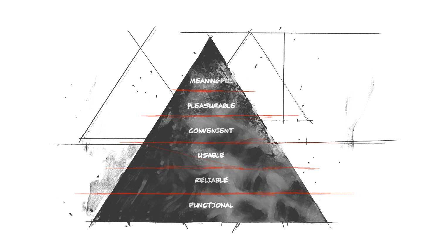
We must know the user and context in depth. Short of that, simplicity is an arbitrary exercise that can do more harm than good. Through research, testing, empathy, and candor, we can design experiences that cut through complexity to deliver on the UX hierarchy of needs: functional, reliable, usable, convenient, pleasurable, and meaningful.
Nothing is absolute
Pithy irony aside, we can’t reduce design to absolutes. There are no universal rules to achieve clarity, only principles to apply thoughtfully. We must be judicious and make choices that balance simplicity and depth, ease of use, and capability. The clearest designs meet people where they are and give them paths to where they want to go.
“Simplicity is relative. What is simple for [one] device may be dumb or intricate for another.” — Raluca Budiu, Ph.d.
Clearly focused on our North star
Focusing on clarity over fashion or dogma we can create designs that serve human needs and potential. Our role is not to simplify but to reduce complexity in context through understanding and empathy. Clarity, not simplicity, should be our North Star. Only by embracing the complexity of design and human experience can we make something seem truly simple.